Company Background:
Assured Hospitality (website) is an Indian hospitality company managing some prime properties across India. After successfully operating for few years and understanding the hospitality market the company wanted to venture into international markets by offering services of travel & tourism in foreign lands. Instead of extending this service the management decided to launch a new travel company by the name of routes to international.
Logo brief:
Clients wanted to keep the logo design short and simple. The brief mentioned not using/creating any existing/new symbol instead if we can do something with the name “Routes to International” or with initials. The logo design should extend the same assurance but needed to be connected with travellers by being very confident of what they are offering and keeping customers at the top always.
Our approach:
Client: Assured Hospitality
Skill: Brand Strategy, Logo Design
Brand Strategy: A travel agency for clients ranging from individuals to mid-cap companies within India works on planning tours and trips by simplifying many options and information’s available today with clients. They advise their clients on the places USP’s, current situation, things to do in and around that place, how to go where to stay and whole lot of stuff. They also find the best way to travel and stay and make sure it fits the consumers budget based on their needs and continue to attend to their specific requirements which can also crop up suddenly.
For individuals this could be as simple as finding them a nice peaceful and comfortable stay with good surroundings to spend some quiet relaxed moments with partners. For corporations this can range from finding the right property to host workshops/ seminars/ training and meetings with some fun based activities to keep the team together.
Being a young entrepreneur in an industry dominated with mostly old established firms and also very unorganised at many levels with layers of sub agents, the client felt a sense of trying to bring new strategies and ideas to the table and evolve faster than their competition while also having to work harder to show their experience and gain trust given their perceived lack of years in the industry. People don’t come to r2i for fun or light-hearted conversation even though it’s about travelling, they come to them for serious conversations that can have big and potentially devastating consequences if things don’t turn out well. They treat every client the same – from the one that earns 20000 a month to the executive that brings them 7, 00,000.
So the fundamental strategy for this client was down to trust based positioning with clients always being assured of complete peace of mind with nothing to worry when travelling abroad. We had to create a brand identity that looks and felt solid and hinted at the professional and robust nature of the expertise r2i brings to the table.
We also considered hinting at “design an experience around customers” based value proposition. It’s not only more pleasant than their competitors; people actually enjoy being there
Brand Solution: To enable us to design a logo that speaks brands proposition we decided to explore wordmark and combination marks based logo designs and direction that involved first alphabets of company’s name and symbols. We also invest time in doing Industry analysis, Competition analysis and Target audience behaviour to BRING IN SOME VALUE ADDITION.
Finally a Higher order symbology was employed to come up with this thought provoking logo.
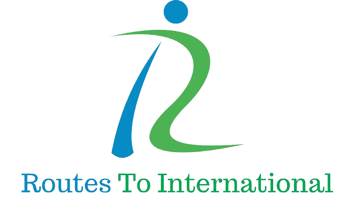
From the various design directions we presented to the client, they chose the final one as seen below.
The logo was designed with “R 2 and i” Colour elements used and explanation. The green part is symbolising route. i was chosen over I to symbolise world through round globe.
GREEN is often associated with the coolness of leaves. People often associate it with nature, health & good luck.
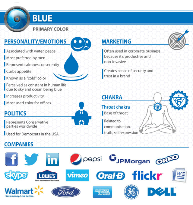
BLUE is often associated with the coolness of the sea and sky. It has been shown to calm the senses and lower blood pressure. It may stimulate feelings of trust, security, order, and cleanliness.
Click on Brand Collaterals to see various other brand identity elements we designed for the company.
Read our views on Are brand collaterals important for startups ?
View All projects Project Enquiry Form


