Graphic Designing
Graphic design is the methodology of visual communication, and problem-solving through the use of type, space and image. The field is considered a subset of visual communication and communication design.
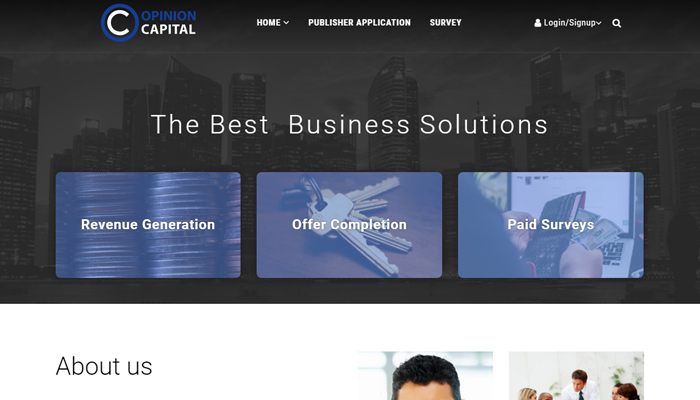
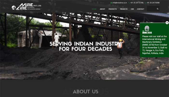
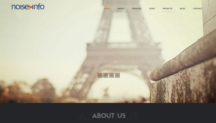
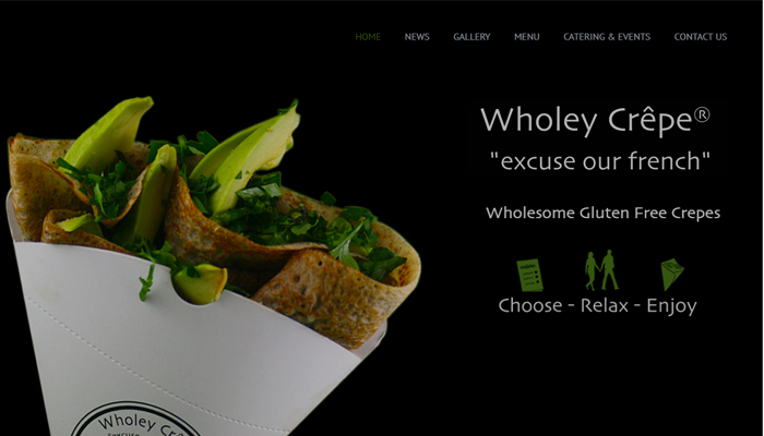
LOGOS DESIGN
PURPOSE
Corporate logos are intended to be the “face” of a company: They are graphical displays of a company’s unique identity, and through colors and fonts and images they provide (should) essential information about a company that allows customers to identify with the company’s core brand. Logos are also a shorthand way of referring to the company in advertising and marketing materials; they also provide an anchor point for the various fonts, colors and design choices in all other business marketing materials.
DESIGN PRINCIPLES
Good logos should be unique and comprehensible to potential customers. Although there are myriad choices for color, visual elements and typography, in general a logo should help convey some information about the company, or be designed in a way that gives some sense of meaning about the company or its industry. For example, cutting-edge firms and tech companies tend to have angular logos to convey speed, while service-oriented firms have rounded logos to provide a sense of service and trust. Are you putting off having your new business’s logo and marketing materials professionally designed until after you get off the ground or land your first clients? If so, you’re making a big mistake. Read why
COMMON MISTAKES
Small businesses often play it fast-and-loose with logos, paying insufficient attention to their proper size and positioning and surrounding them with materials–including clipart–that compete with them visually. Avoid re-creating different types of logos for specific purposes (e.g., letterhead and business cards) or having similar-but-not-identical versions for print and online purposes.
Read How We Designed R2i Logos
LANDING PAGES
PURPOSE
If your business is anything like the hundreds we’ve already helped, there is a lot of low-lying fruit within reach! We’ll show you how to double, even triple the number of leads and sales you get without spending more on advertising.
A landing page, simply put, is any page that gets traffic from anywhere other than the same pages on your site — hence the name landing. It’s most commonly associated with pay-per-click ads like Google Adwords, where you can drive traffic to a specific URL that has been designed to receive those visitors.
The problem with most landing pages is that they’re created around broad categories like “jeans” instead of being more specifically focused like “women’s skinny jeans” or “juniors bootcut jeans”. These days, people intuitively understand that when searching the web, the site whose description most closely matches their search is likely to be the winner. And when you’re paying for clicks — you’re losing money every time a customer goes elsewhere.
Is my home page a landing page? Read Blog Post
WHY USE LANDING PAGES?
For better SEO
PPC
Better conversions CRO ( Conversion rate optimization)
Social media marketing
As destinations in your pay-per-click ads / Email marketing
To create anticipation about a product launch
To segment your offers
To segment your audience
BRAND COLLATERALS
PURPOSE
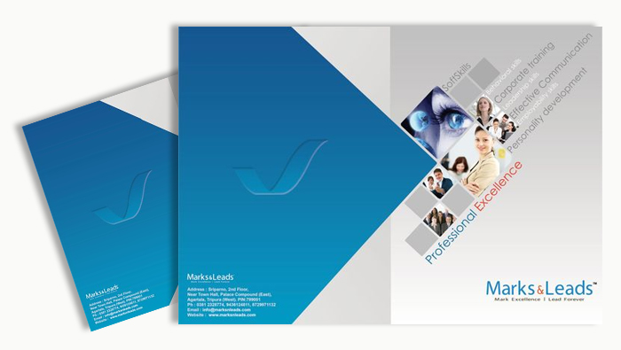
Corporate image material such as letterheads, envelopes, signage, presentations, banners, corporate gifts, business cards and other brand collateral like- case studies, white papers, press realease, business proposals convey volumes about your business status. In some cases it’s a business card which makes the first impression, therefore we make sure that your corporate materials are designed sophisticatedly and care is taken by our team giving attention to the minute details.
The collateral of your brand is often the first impression of your product or service and first impressions really count.
To remain competitive, you need to provide information about your company to employees, investors, existing and potential clients, media, and the general public on an ongoing basis. Your company’s success depends on how well you communicate what you have to offer.
This, in turn, may depend on how well you prepare collateral items (brochures, newsletters, fact sheets, press releases, and other electronic and printed promotional materials), ranging from company and product fact sheets to biographies of key team members.
Every business should always have the following five items on hand, ready to distribute. Read Blog Post.
Starting your business without a well-thought-out logo and marketing materials puts your small company at a big disadvantage compared to the competition.
A professional-looking business logo and marketing materials help make your new business more visible and credible-two key factors in its growth and success. But because they lack customers and cash flow, many entrepreneurs try to save money by designing their own marketing materials. It’s easy enough to design a business card or logo at the local office supply store or online, but if you don’t have design or marketing expertise, doing so could cause more problems than it solves.
EMAILER
PURPOSE
Designing a HTML email is all about keeping your design simple and straightforward, and focusing on your message. It is also important to keep your emailer design elements specifics depending on whether you are designing for desktop, web email clients, or mobile devices. Some of the important elements of any good email design are:
· Calls to Action
· Images
· Layout and Purpose
· Mobile Friendliness
· Typography
When done correctly, email is still one of the best ways to promote you and your clients online. In fact, a “recent survey“ showed that every dollar spent on email marketing in the year 2014 generated more than $40 in return. That’s more than any other marketing channel, including the cool ones (Social media sites).
There are a whole host of ingredients that contribute to a good email marketing campaign. Permission, relevance, timeliness and engaging content are all important. Even so, the biggest challenge for designers still remains building an email that renders well across all the popular email clients.
While it’s not without its challenges, rest assured it can be done. In our experience the key is to focus on three things. First, you should keep it simple. The more complex your email design, the more likely is it to choke on one of the popular clients with poor standards support. Second, you need to take your coding skills back a good decade. That often means nesting tables, bringing CSS inline and following the coding guidelines. Finally, you need to test your designs regularly. Just because a template looks nice in Outlook.com now, doesn’t mean it will next week or in other email clients.








Tell us about your project
Let us help you get your business online and grow it with passion
Harness the full power of open-source frameworks, contact us and get a bespoke content-manageable website that suits exactly your needs and requirements.
